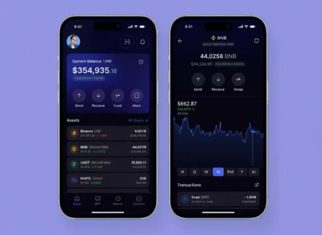
Wallet UX is where good growth goes to die. People arrive excited, then they hit a wall: a scary pop-up, a weird network name, a fee they did not expect, or a signing request that reads like it was written by a bored lawyer. Then they leave, and you call it “low intent” to protect your feelings.
Today’s blog is about the wallet UX patterns that keep users moving. The headline says 30%+ drop-off reduction because these patterns remove the same friction points people complain about again and again: confusion, fear, and surprise. If you fix those three, more users finish the flow, and they come back.
Quick Answers – Jump to Section
- Why wallet UX causes so much drop-off
- What users keep asking about wallet onboarding
- Pattern 1: Let users start before they connect
- Pattern 2: Use one clear connect choice first
- Pattern 3: Explain signing like a human
- Pattern 4: Make chain switching feel safe
- Pattern 5: Show fees early and in plain numbers
- Pattern 6: Add a “panic exit” and a “try again”
- Pattern 7: Confirm success with next steps
- Pattern 8: Build a recovery path for lost users
- Final Thoughts
- Frequently Asked Questions
Why wallet UX causes so much drop-off
Web3 asks users to do strange things. They have to install a wallet, save a seed phrase, approve a connection, sign a message, maybe switch networks, then pay a fee to do the first real action. Each step is a chance to lose them, and the steps often feel risky because the user does not know what they are agreeing to.
The other problem is that the wallet UI is not your UI. You can write a clean onboarding flow, then the wallet throws a pop-up that looks like a warning from 2007. That mismatch makes users think something is wrong, even when everything is fine.
What users keep asking about wallet onboarding
The same questions show up everywhere, just with different swear words. People ask why they need to connect a wallet just to look around, why a signing request looks scary, and why the fee changes between wallets. They also ask why switching networks feels like a trap, and why a transaction can be “pending” for ages with no clear next step.
A lot of this is not about tech. It is about confidence. If your flow makes users feel calm and in control, they keep going. If it makes them feel confused or rushed, they close the tab and tell their friends Web3 is “too hard.”
Pattern 1: Let users start before they connect

Do not force a wallet connect at the door unless you truly need it. Let users browse, simulate, or preview the action first, then ask for a connect only when the next step needs a wallet. This keeps the early experience simple, and it stops the “why are you asking me for this already?” reaction.
If you want a practical way to structure this, think of it like a product demo. Show the value, then ask for the commitment. You can still track intent with normal web analytics and event tracking, and if you care about measurement in AI search, check this piece out on staying visible without clicks.
Pattern 2: Use one clear connect choice first
A connect modal with 14 wallet buttons is not “user choice.” It is a stress test. Start with one primary option based on the user’s device, then show “More options” for everyone else. Mobile users usually want a mobile-friendly path, and desktop users usually want the browser extension they already have.
Also, name the outcome, not the tool. Instead of “MetaMask,” you can label the primary button “Connect your wallet,” then show wallet brands after the click. If you want more examples of how small wording changes reduce drop-off, the practical breakdown in this wallet onboarding guide maps well to what users do in the real world.
Pattern 3: Explain signing like a human
Signing is where users panic, because the wallet text often looks like nonsense. So you add a short, plain-language explanation right before the wallet pop-up appears. Tell them what the signature does, what it does not do, and what they should check.
For example: “This signature proves you own the wallet. It does not move funds.” Then add one line about what they will see next. If you want to go deeper on why users fear signatures, this breakdown of wallet safety mid-sentence is a good reference point: how AI agents can help secure wallets because it matches the questions people ask when they feel unsure.
Pattern 4: Make chain switching feel safe
Chain switching feels scary because it looks like you are changing the rules mid-game. So you make it predictable. Tell users the exact network name, why it is needed, and what will happen if they do not switch.
Then, after the switch, confirm it worked in your UI, not just in the wallet. A simple “You’re on Base, you’re good” message reduces doubt. People ask on forums why some wallets feel easier across chains, and the answer is nearly always the same: fewer surprises, clearer confirmation, and fewer steps.
Pattern 5: Show fees early and in plain numbers
Fees are not the problem. Surprise fees are the problem. Show an estimate before the user hits the wallet, and show it in a way that makes sense, like “about $0.12” plus the token amount. If the fee can spike, say so in one calm sentence.
Also, explain why the fee can differ between wallets. Users ask this a lot, and it is usually because wallets use different default settings, different routing, or different speed choices. If you explain that upfront, you reduce the “is this a scam?” moment.
Pattern 6: Add a “panic exit” and a “try again”
Users get stuck. A wallet pop-up fails, a transaction fails, or the user closes the wallet by mistake. If your UI has no recovery path, they assume the whole thing is broken and they leave.
So give them two obvious buttons: “Cancel safely” and “Try again.” Then show a short reason if you can, like “Wallet request timed out.” This is boring UX, which is exactly why it works.
Pattern 7: Confirm success with next steps
When a transaction succeeds, do not just show a green tick and call it a day. Tell the user what happened, what they now have, and what to do next. If the next step is “stake,” “bridge,” or “deposit,” link them straight into it.
This also helps retention. Users ask why wallets feel fine at first but annoying later, and a big reason is that apps do not guide them after the first win. A clear “next best action” keeps the momentum.
Pattern 8: Build a recovery path for lost users
Some users will leave mid-flow, and you should plan for that. Save state in the app, so when they come back, you can say “You were halfway through, want to continue?” If you have email or social login, you can also send a gentle reminder that does not sound like a desperate ex.
This is also where you can connect UX to growth. If you know where users drop, you can fix the step, or you can add a small helper message at the exact moment they get stuck. If you want a clean way to pick what to measure, this on-chain metrics guide mid-sentence can keep your tracking focused: the on-chain signals investors care about are often the same actions users struggle to complete.
If you want a clean measurement stack for these fixes, the tracking setup in this Web3 analytics guide can help you pick what to instrument first.
Final Thoughts
Wallet UX is not a “nice to have.” It is your conversion rate. If your flow makes users feel confused, rushed, or surprised, they will leave, and they will blame Web3, not your product.
Pick two friction points to fix first, then measure the drop-off before and after. Start with signing clarity and fee transparency, because those two kill confidence fast. After that, make chain switching calm, add recovery paths, and you will see the numbers move in the right direction.
Frequently Asked Questions
What causes the biggest wallet onboarding drop-off?
The biggest drop-offs usually happen at wallet connect, signing requests, chain switching, and fee surprises. Users leave when they feel unsure or when the next step looks risky.
How do I explain a signing request to users?
Use one short sentence that says what the signature does, and one short sentence that says what it does not do. Then tell them what they will see next.
How do I reduce chain switching confusion?
Tell users the exact network name, why it is needed, and confirm the switch worked inside your UI right after it happens.
Why do gas fees look different in different wallets?
Wallets can use different default settings, speed choices, or routing. That can change the final fee estimate even at the same moment.
Should I force wallet connect on the first page?
Only if the user cannot do anything useful without it. If they can browse, preview, or simulate first, let them do that, then ask for a connect at the moment it becomes necessary.
_________________________________________________________________
Download your free copy of the Growth Engine Blueprint here and start accelerating your leads.
Want to know how we can guarantee a mighty boost to your traffic, rank, reputation and authority in you niche?
Tap here to chat to me and I’ll show you how we make it happen.
If you’ve enjoyed reading today’s blog, please share our blog link below.
Do you have a blog on business and marketing that you’d like to share on influxjuice.com/blog? Contact me at rob@influxjuice.com.
Latest Blogs
- Stablecoins as a Business Payment Tool: A Practical Guide for Non-Crypto Companies
- 6 AI Tool Tactics Fintech Brands Use to Appear in ChatGPT
- Why Most Web3 Marketing Agencies Fail at SEO
- 5 African Fintech Startups Using Blockchain to Fix Cross-Border Payments
- Keyword research for Web3 teams that want buyers, not random clicks

