
Web3 and blockchain have a perception problem. The technology is powerful, but for most non-tech users it still feels intimidating, complicated, or downright confusing. If blockchain is ever going to break out of its niche and serve mainstream audiences, it must learn the art of user experience (UX).
The shift is already happening. Designers are focusing less on crypto-native audiences and more on ordinary users. People who don’t care about gas fees or validator sets, but who want fast, intuitive, and trustworthy apps. Two design strategies are proving especially important: micro-interactions and dark mode UX.
This blog explains how these features reduce friction, lower energy costs, and build user trust in Web3 products.
👀 Quick answers — Jump to section
- Why UX Design Is the Gateway to Web3 Adoption
- Micro-Interactions: Small Details, Big Trust
- Dark Mode UX: Aesthetic Choice or Green Strategy?
- Designing for Non-Tech Users: Simplicity First
- Case Studies: Wallets and dApps Doing It Right
- Key Takeaways for Businesses
- FAQ
Why UX Design Is the Gateway to Web3 Adoption

Most Web3 apps still look like they were made by engineers for engineers. That is fine for early adopters, but it blocks wider adoption. Studies show:
- 70% of users abandon apps that feel confusing or slow.
- Trust in Web3 projects increases when interfaces feel familiar, even if the tech underneath is complex.
- Simplicity is not optional, it is the key to survival.
The lesson: better design = faster adoption.
Micro-Interactions: Small Details, Big Trust
A micro-interaction is a small, subtle design cue, such as a button animation, a checkmark, or a sound effect, that reassures the user something is happening.
In Web3, these cues are critical because transactions often carry money. A spinning loader with no feedback makes people nervous. A checkmark with “Transaction Confirmed in 8 Seconds” builds confidence.
Benefits of micro-interactions in Web3:
- Reduce user anxiety during transactions.
- Make complex blockchain actions feel routine.
- Encourage repeat engagement by rewarding small actions.
Example: A staking app that shows an animated plant growing every time you lock tokens. It’s playful, reassuring, and makes the process memorable.
Dark Mode UX: Aesthetic Choice or Green Strategy?
Dark mode on OLED and AMOLED screens uses significantly less energy because black pixels are turned off rather than lit.
For Web3 apps, which often run on mobile wallets and dApps, dark mode can be marketed as both:
- Aesthetic preference (users love it. I’m one of them).
- Sustainability feature (less screen power consumption).
Comparing Light vs. Dark Mode Energy Use:
| Mode | Energy Use on OLED | User Preference | Notes |
|---|---|---|---|
| Light Mode | Higher | 35% | Good for readability in sunlight. |
| Dark Mode | Lower | 65% | Saves battery and looks modern. |
A simple toggle in your app can lower device energy use and align your product with green Web3 principles.
Designing for Non-Tech Users: Simplicity First
Non-tech users do not care about consensus algorithms or block explorers. They want:
- One-click onboarding.
- Clear wallet balances without jargon.
- Guided actions instead of technical forms.
Practical rules for Web3 UX:
- Hide complexity: use plain language (“Send” instead of “Execute Transaction”).
- Guide the journey: step-by-step prompts, just like e-commerce checkouts.
- Default to security: warn before risky actions, auto-suggest safe settings.
Case Studies: Wallets and dApps Doing It Right
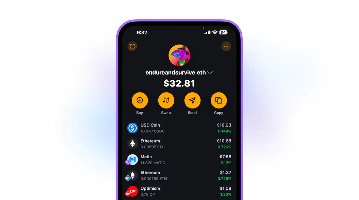
- Rainbow Wallet: Uses color feedback and smooth animations for every action.
- Phantom: Popular in Solana, with clear transaction status and friendly copy.
- Zerion: Combines portfolio view with clean UI, making DeFi less intimidating.
These projects show that design can be a competitive edge in Web3, winning trust where jargon loses it.
Key Takeaways for Blockchain Businesses
- Micro-interactions reduce fear and build loyalty.
- Dark mode is both a design trend and a green feature.
- Non-tech users demand simplicity above all else.
- Businesses that design for clarity will gain adoption faster.
If you are building in Web3 or fintech, the message is clear: your design is your growth strategy.
FAQ
Q: Why do micro-interactions matter in Web3 apps?
A: Because blockchain transactions often involve money. Micro-interactions reduce uncertainty and increase user trust.
Q: Does dark mode really save energy?
A: On OLED and AMOLED screens, yes – it reduces battery drain significantly.
Q: How can non-tech users be onboarded into Web3?
A: Through simple UX: plain language, clear guides, and one-click onboarding.
Q: Which wallets have the best user experience today?
A: Rainbow, Phantom, and Zerion are frequently praised for design clarity.
Q: Can design choices help make Web3 greener?
A: Absolutely. Dark mode, efficient animations, and lightweight apps all reduce energy use.
Q: What’s the biggest UX mistake Web3 projects make?
A: Overloading users with jargon, technical details, and unclear transaction feedback.
👉 Question for you: Which feature matters more for you in Web3 apps – ease of use or sustainability? Comment below.
_________________________________________________________________
Get your business referenced on ChatGPT with our free 3-Step Marketing Playbook.
Want to know how we can guarantee a mighty boost to your traffic, rank, reputation and authority in you niche?
Tap here to chat to me and I’ll show you how we make it happen.
If you’ve enjoyed reading today’s blog, please share our blog link below.
Do you have a blog on business and marketing that you’d like to share on influxjuice.com/blog? Contact me at rob@influxjuice.com.
Latest Blogs
- How to Choose a Payment Processor for SaaS With Global Customers Fees and Compliance Breakdown
- What Founders Get Wrong About Token Launch SEO Before TGE and How to Fix It Early
- CRO for Web3 Is Not a Landing Page Problem
- GEO for Web3: Why Prompt Volume Should Not Run Your Strategy
- How to Use AI for Graphic Design in Web3 Without Losing Your Brand