Are you ready to transform your landing page from average to exceptional? We’ve analyzed top-performing pages, gathered data, and distilled the essential elements that make a landing page both effective and high-converting. From crafting attention-grabbing headlines to leveraging social proof, we’ve got you covered. Grab a notebook, and let’s elevate your landing page strategy…
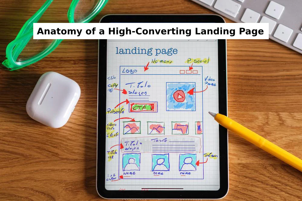
The Essential Elements of a High-Converting Landing Page
A landing page is a standalone webpage designed to turn visitors into customers or leads. To make it effective, you need a tailored message that resonates with your audience and compels them to take action. Here are the key elements that drive conversions:
- Clear and Compelling Headline:
- The headline is the first thing visitors see, so it must be concise, engaging, and relevant. It should align with the ad or link that brought them to the page, creating a seamless experience.
- Strong Value Proposition:
- Your value proposition should clearly explain how your product or service solves the visitor’s problem. Place it prominently above the fold to ensure it’s immediately visible and impactful.
- Social Proof:
- Testimonials, reviews, and trust badges build credibility and trust, increasing the likelihood of conversions. Social proof reassures visitors that others have benefited from your offering.
- Single, Focused Offer:
- A landing page should have one primary offer and call-to-action (CTA). This clarity helps visitors understand the purpose of the page and encourages them to take the desired action.
- Conversion-Centered Layout:
- Use whitespace, color contrast, and directional cues to make your CTA stand out. A well-structured layout guides visitors toward the conversion goal.
- A/B Testing and Optimization:
- Continuously test and refine your landing page to improve performance. A/B testing different versions can help you identify what works best for your audience.
Inspiring Landing Page Examples
1. Netflix
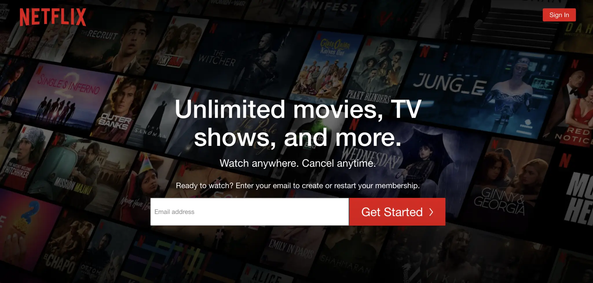
Netflix’s landing page demonstrates how simplicity drives conversions. The single-email signup form removes friction, while autoplay previews of trending shows create instant engagement.
Why it works:
- One-click entry: A minimal form field reduces abandonment.
- Dynamic previews: Auto-playing trailers showcase content without requiring clicks.
- Bite-sized FAQs: Expandable questions address pricing concerns discreetly.
- Mobile-first design: Responsive layouts ensure seamless viewing across devices.
2. Shopify
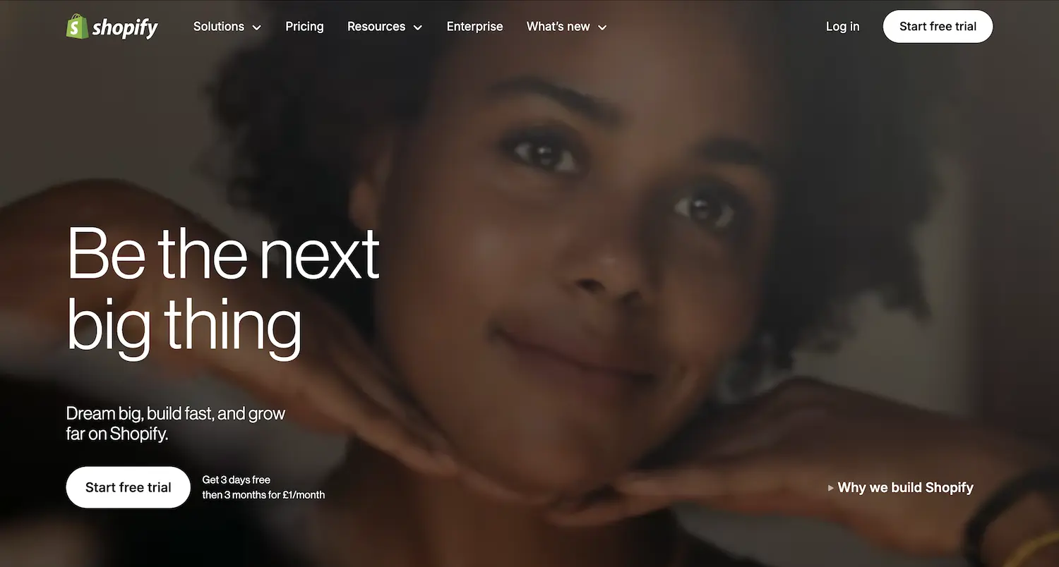
Shopify’s page targets entrepreneurs with clarity. The headline “Build your business” speaks directly to aspirations, while trust badges (e.g., “1M+ businesses”) validate scalability.
Why it works:
- Hero CTA prominence: The free trial button dominates above-the-fold space.
- Social proof stacking: Client logos (e.g., Gymshark) build credibility.
- Benefit-driven icons: Visual cues (e.g., cart + globe) communicate global selling.
3. Vrbo
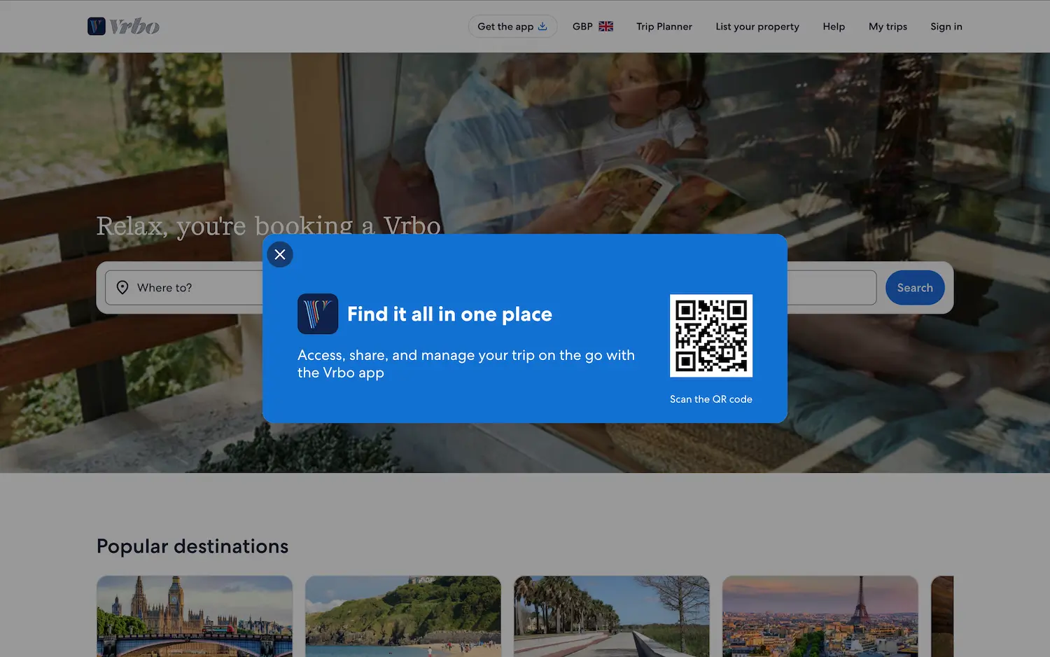
Vrbo’s landing page effectively highlights its vacation rental offerings while establishing credibility and mobile accessibility:
- Personalization: Displays property earnings potential for hosts based on their market.
- Intuitive Search: Lets travelers easily filter by destination, dates, and amenities.
- Trust Signals: Features verified guest reviews and endorsements from trusted travel sources.
- QR Code Convenience: A scannable QR code lets users “access, share, and manage your trip on the go with the Vrbo app”—bridging desktop-to-mobile seamlessly.
- Visual Appeal: High-quality images of unique rentals inspire bookings.
4. Zillow
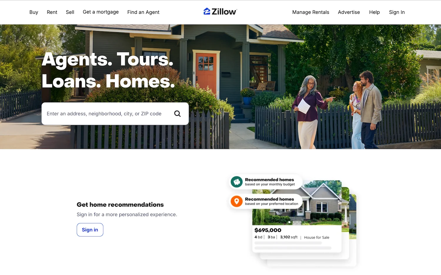
Zillow’s real estate page prioritizes local relevance. The search bar defaults to the visitor’s detected city, and “Zestimate” price estimates establish authority.
Why it works:
- Hyperlocal SEO: Neighborhood pages rank for “homes in [city]” queries.
- Data transparency: Mortgage calculators appear alongside listings.
- Trust cues: Partner badges (e.g., MLS) validate listing accuracy.
5. Woolx
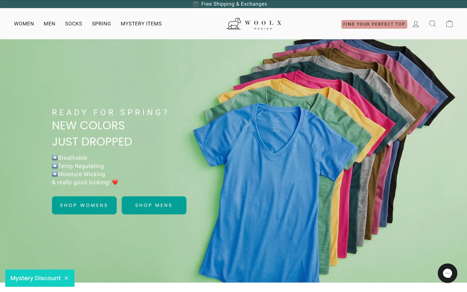
Woolx’s product page turns fabric into a selling point. A looping video shows Merino wool’s temperature regulation in action—from snowy hikes to casual wear.
Why it works:
- Sticky promotions: A 10% discount bar persists during scrolling.
- Material-focused copy: “100% Australian Merino” appears 3x on the fold.
- Lifestyle imagery: Photos depict durability across climates.
6. Webprofits
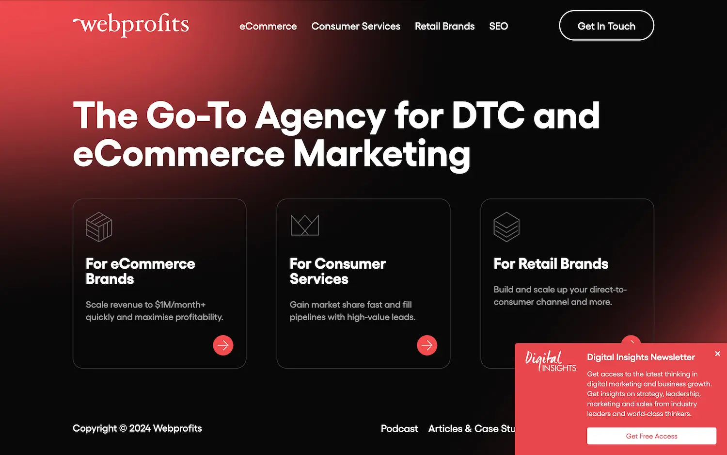
This B2B page replaces jargon with results. Case study headlines like “+300% ROI in 6 months” speak to revenue-focused visitors.
Why it works:
- Free Newsletter: Promotes its “Digital Insights Newsletter” for actionable marketing tips.
- Case Study Highlights: ROI-driven results from past clients.
- Consultation CTA: “Get Your Free Strategy Session” button stands out.
7. Impactplus
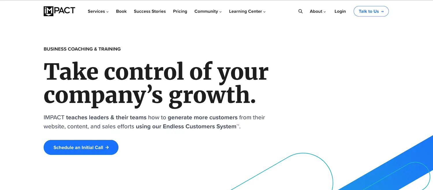
Impactplus uses video storytelling to build trust. Founder interviews explain their methodology, while downloadable templates offer immediate value.
Why it works:
- Gated resources: Ebooks require email signups, capturing leads.
- Subtle urgency: “Limited-time strategy session” nudges action.
8. Nanor
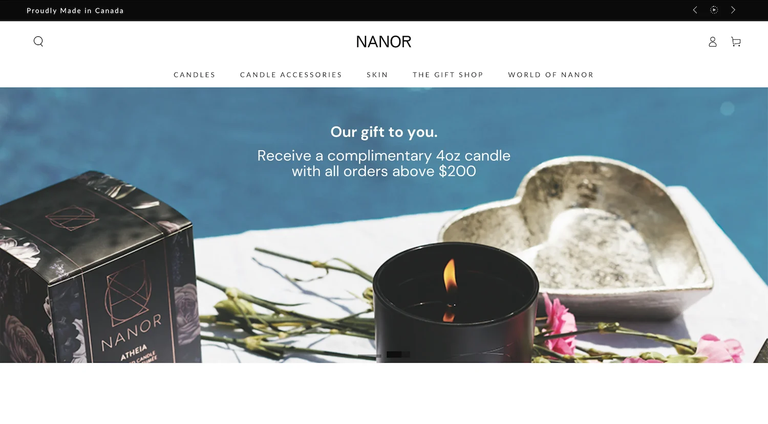
Nanor’s luxury candle page leans into sensory appeal. Hover effects release scent descriptions (e.g., “Vanilla + Amber”), mimicking in-store sampling.
Why it works:
- Gift with Purchase: All orders over $200 receive a free 4oz artisan candle.
- Lifestyle Imagery: Shows products in aspirational home settings.
- Countdown Timers: Creates urgency for seasonal collections.
9. Progress Telerik
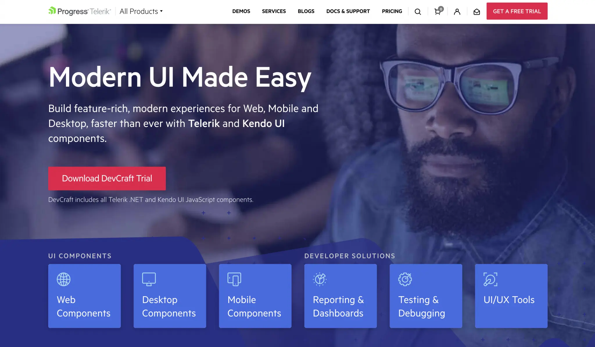
This dev tool page balances technical depth with accessibility. Interactive code sandboxes let users test APIs without downloading.
Why it works:
- Role-specific paths: Separate CTAs for developers vs. managers.
- Integration badges: Logos like Microsoft/.NET assure compatibility.
10. Evernote

Evernote’s scroll-triggered animations demonstrate features contextually. As users scroll, sticky notes “organize themselves” to showcase workflows.
Why it works:
- Micro-interactions: Animated transitions highlight usability.
- Use-case segmentation: Headlines address students, teams, etc., separately.
11. Gogoro
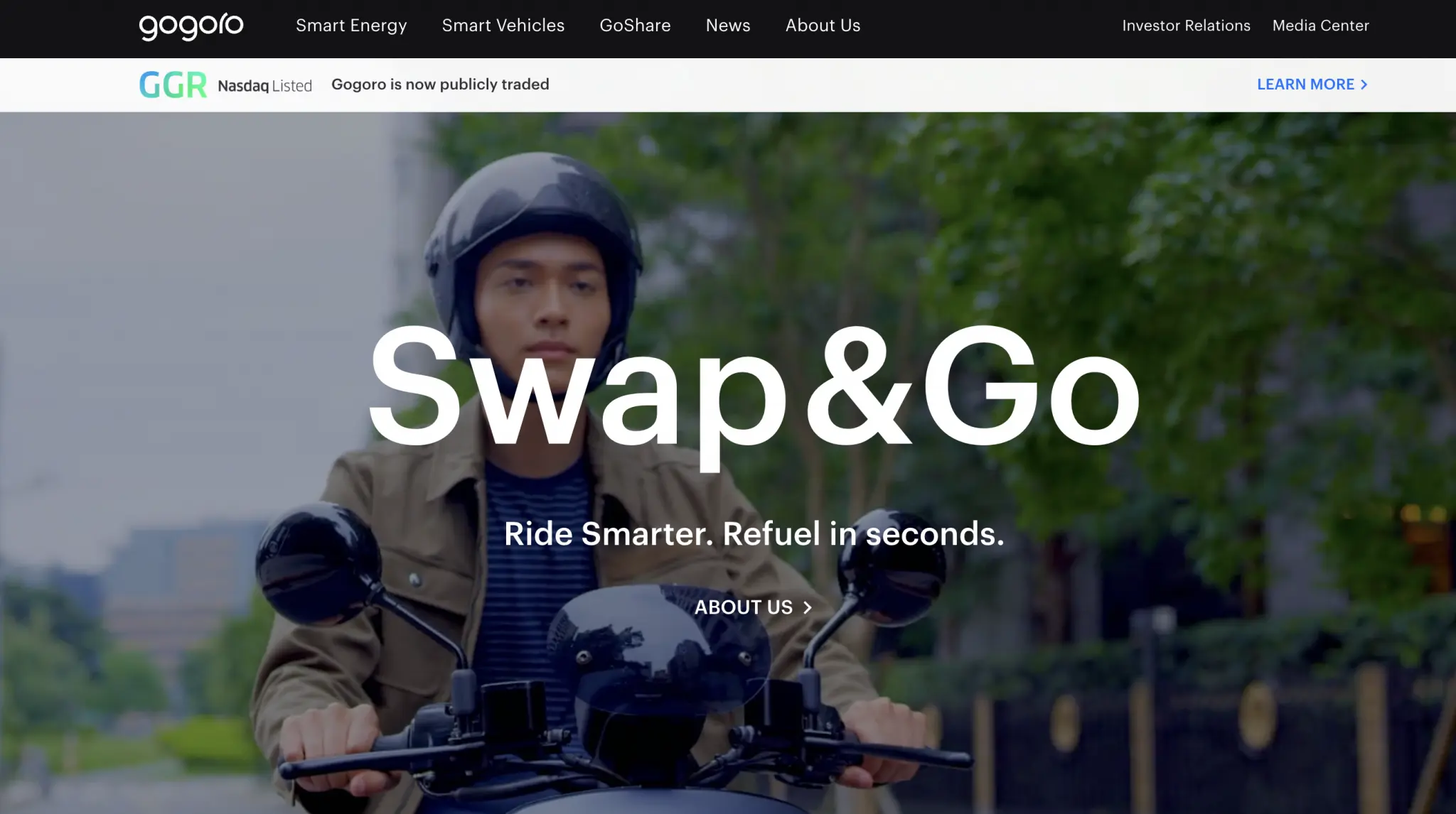
Gogoro Network’s landing page demonstrates how smart design and storytelling can elevate an electric scooter brand. The tagline “Ride Smarter. Refuel in seconds” instantly conveys efficiency—a core selling point for urban commuters.
Why it works:
- Concise value proposition: The tagline cuts through noise by focusing on speed and convenience.
- Trust-building partnerships: Highlighting partner brands (Yamaha, Acer) adds credibility.
- Immersive interactivity: Users can explore battery-swapping stations via an interactive map.
- Visual storytelling: Crisp lifestyle imagery shows scooters in action, making benefits tangible.
- Minimalist layout: Ample white space keeps focus on key features without clutter.
12. Windscribe
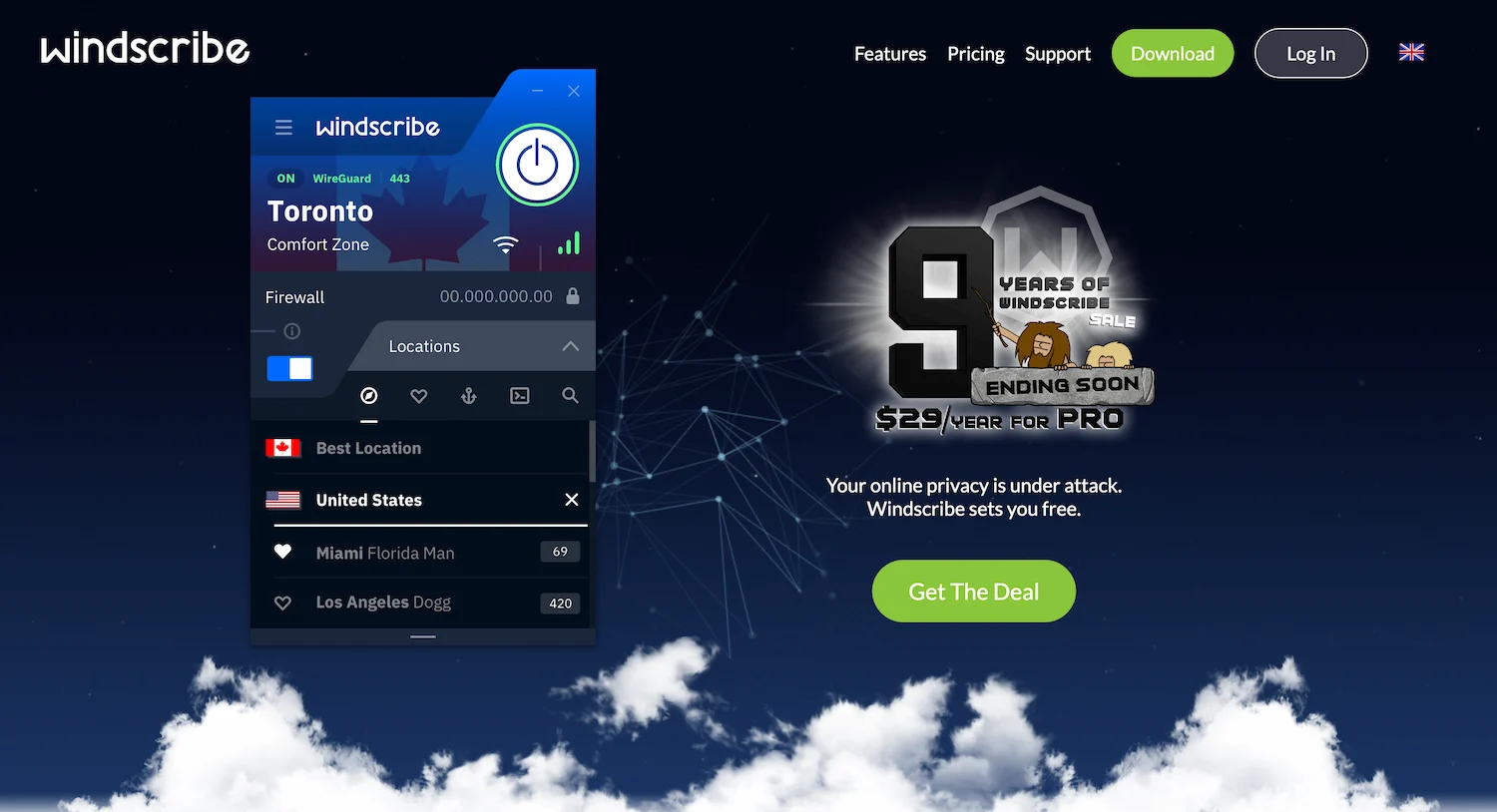
Windscribe’s landing page excels at converting privacy-conscious visitors into users. The design eliminates distractions, pushing visitors toward a free trial—no credit card required.
Why it works:
- Limited-Time Deal: Celebrates its 9-year anniversary with a **29/yearProsubscription∗∗sale(normally29/yearProsubscription∗∗sale(normally69).
- Transparency: “No-log policy” explained in plain language.
- Tiered Pricing: Free vs. Pro features compared side-by-side.
13. Dr. Shefaly’s Coaching Institute
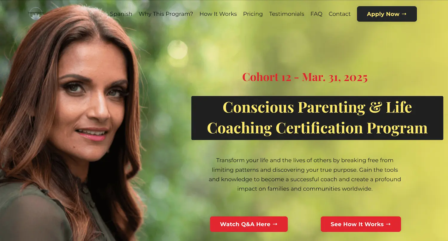
This page masterfully blends psychology and design to convert hesitant visitors. A sidebar FAQ tackles objections like “Is this right for me?” beside the application form.
Why it works:
- Preemptive objection handling: Q&A sections reduce friction during sign-ups.
- Dual-format testimonials: Video clips and written quotes cater to different user preferences.
- Scannable benefits: Bullet points break down program outcomes (e.g., “Clarity in 30 days”).
14. Uber
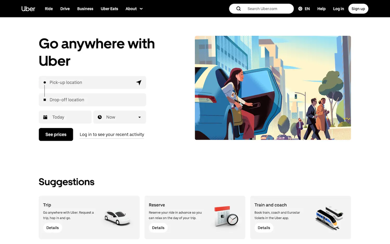
Uber’s driver-recruitment page balances simplicity with persuasion. The headline “Drive when you want” appeals to gig workers seeking flexibility.
Why it works:
- Monochrome professionalism: Black/white tones feel sleek yet approachable.
- Speed-optimized form: Only essential fields (name, phone) appear upfront.
- Contextual imagery: Photos show drivers earning via the app, reinforcing the value.
15. ClassCreator
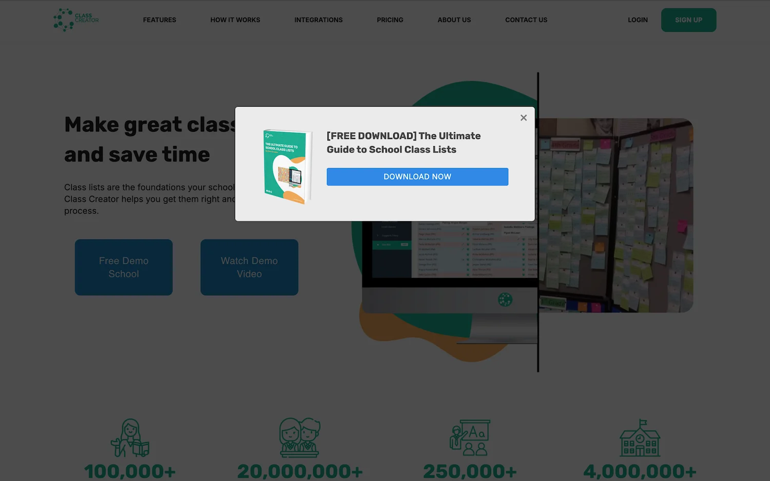
Targeting school administrators, this page uses data to persuade. A floating nav bar ensures CTAs (“Schedule Demo”) stay visible during scrolling.
Why it works:
- Free Lead Magnet: Offers a downloadable ebook, “The Ultimate Guide to School Class Lists”, to capture emails.
- Step-by-Step Demo: Interactive walkthrough removes onboarding friction.
- Testimonials: Highlights praise from teachers and administrators.
16. Intercom
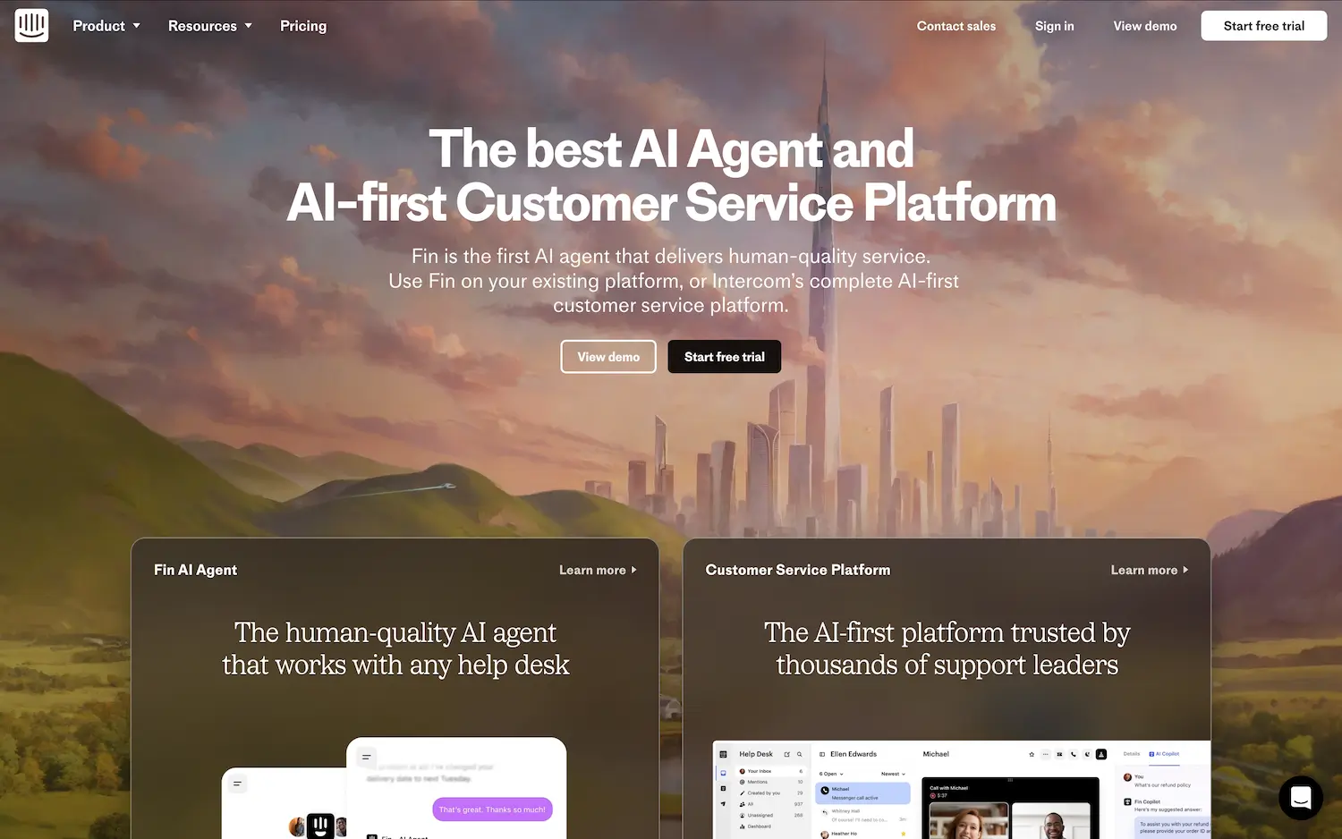
Intercom’s page showcases its AI chatbots through micro-interactions. Hover animations demonstrate how bots resolve customer queries in real time.
Why it works:
- Interactive previews: Animations let visitors “test-drive” the product.
- Benefit-driven copy: Each feature ties to outcomes (“Reduce support tickets by 30%”).
17. Lyft
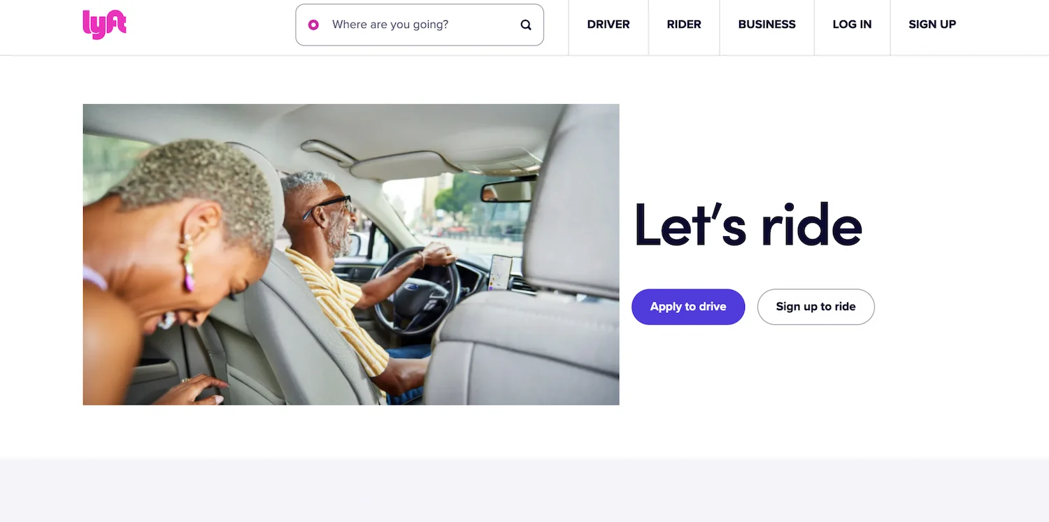
Lyft’s driver sign-up page uses warmth (pink accents) and efficiency (a 3-field form) to onboard Uber drivers quickly.
Why it works:
- Brand consistency: Pink evokes Lyft’s identity without overwhelming.
- FAQ as a closer: Detailed answers address concerns post-CTAs.
18. Spotify
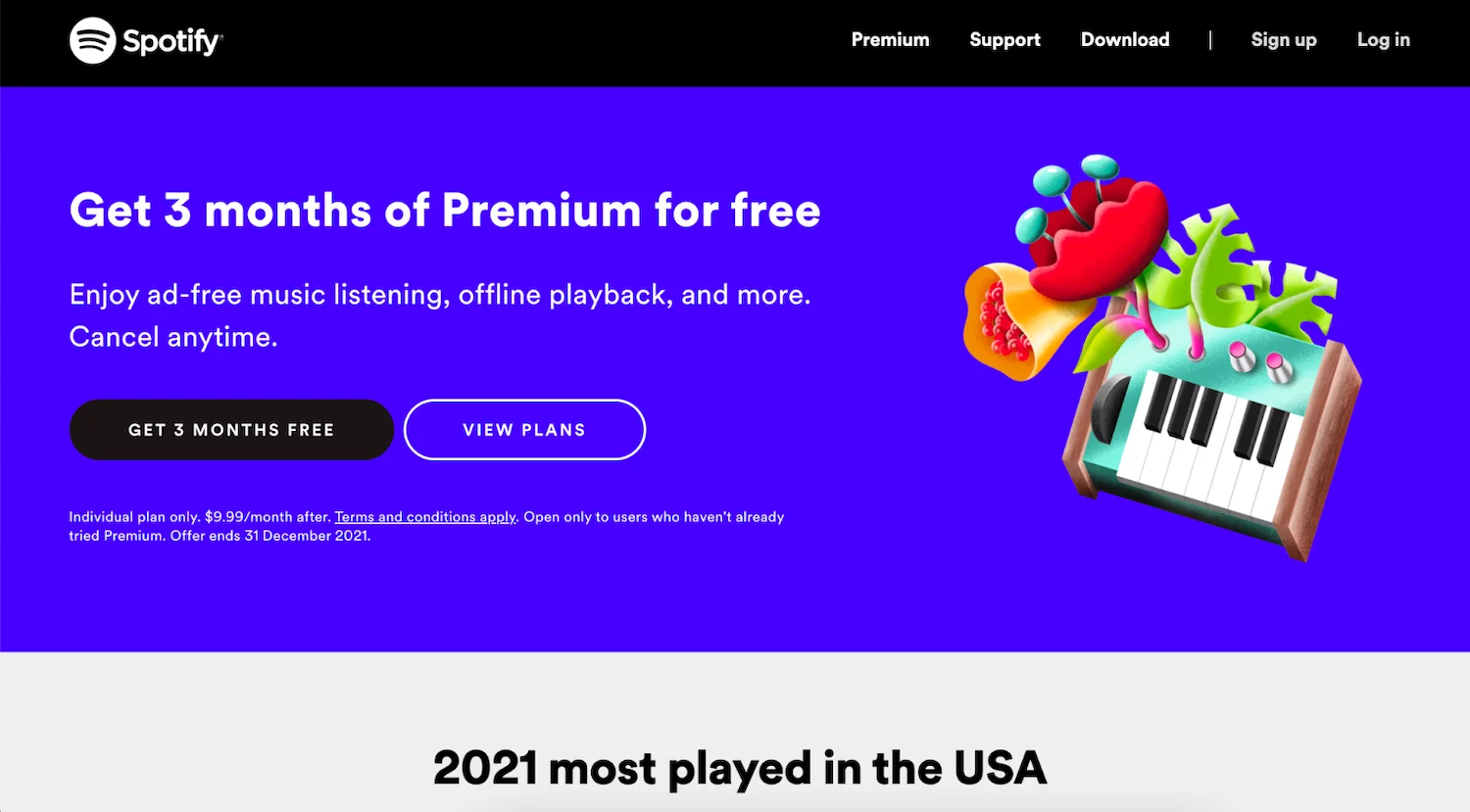
Spotify’s year-end landing page leverages FOMO. Lists like “Top 2023 Podcasts” nudge visitors to join and discover trends.
Why it works:
- Contrast-driven CTAs: Black buttons on white background demand clicks.
- Cultural relevance: Trending content acts as a conversion hook.
19. Databricks
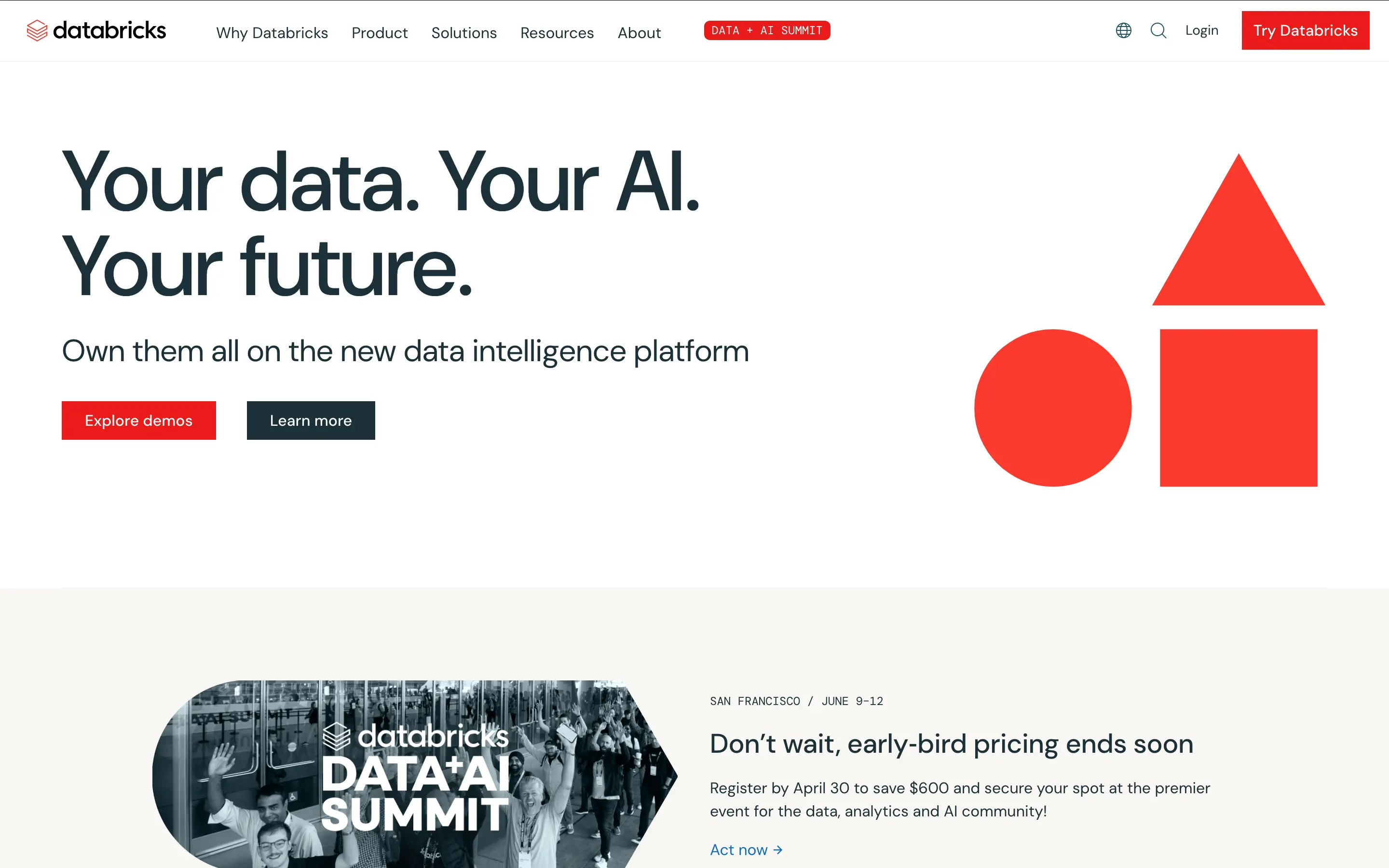
This B2B page balances technical depth with clarity. A “Watch Demo” button sits beside use cases for data teams.
Why it works:
- Role-specific messaging: Headlines address data engineers vs. analysts differently.
- Trust badges: Logos of clients (e.g., HSBC) validate enterprise readiness.
20. Slack
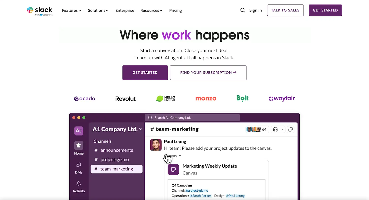
Slack’s page focuses on usability. Animated GIFs show how channels organize conversations—more persuasive than static screenshots.
Why it works:
- Product-in-action visuals: GIFs demonstrate workflows without a login.
- Social proof hierarchy: User counts appear before testimonials.
21. Canva
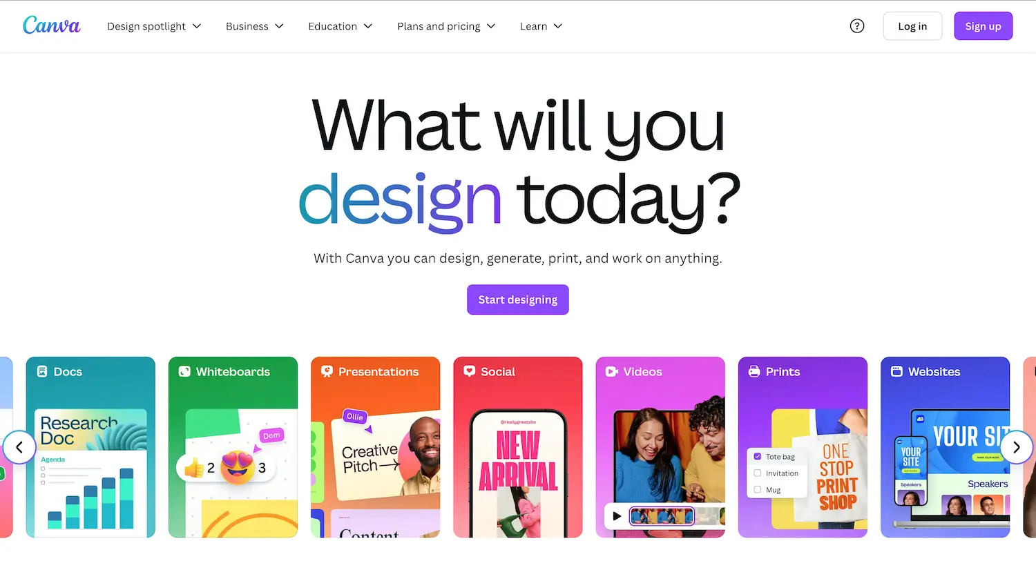
Canva’s design-centric page uses vibrant thumbnails of templates. The “Design with confidence” subhead reassures non-designers.
Why it works:
- Guided onboarding: A 3-step “How it works” section reduces learning curves.
- Transparency: FAQ headers like “Is Canva really free?” build trust.
Let’s Drive Traffic and Sales to Your Business
Landing pages are a critical part of any online marketing strategy. They serve as the first point of contact for potential customers, and a well-designed page can significantly boost conversions.
The examples and elements shared here provide a roadmap for creating high-converting landing pages. However, remember that a great landing page is just one piece of the puzzle. A comprehensive content marketing strategy is essential to drive targeted traffic and sales.
Effective landing pages blend clarity, social proof, and frictionless CTAs. While these examples provide inspiration, remember that continuous testing (A/B layouts, CTA wording) is key to maximizing conversions.
If you’re looking to promote your business online and drive hyper-targeted traffic, consider working with InfluxJuice’s content marketing services. Our omnipresent content search engine marketing will amplify your business’ visibility, whilst our data-driven strategies help turn visitors into customers.
Chat to our team of experts and we’ll help you craft a strategy that takes your business to the next level.
_________________________________________________________________
Want to know how to increase customers and sales for your business?
Tap here to chat to me and I’ll show you how we make it happen.
If you’ve enjoyed reading today’s blog, please share our blog link below.
Do you have a blog on business and marketing that you’d like to share on influxjuice.com/blog? Contact me at rob@influxjuice.com.
Want to know how we can guarantee a mighty boost to your traffic, rank, reputation and authority in you niche?
Click here to access our Playbook – ‘SEM/GEM Guide’.
Latest Blogs
- How to Choose a Payment Processor for SaaS With Global Customers Fees and Compliance Breakdown
- What Founders Get Wrong About Token Launch SEO Before TGE and How to Fix It Early
- CRO for Web3 Is Not a Landing Page Problem
- GEO for Web3: Why Prompt Volume Should Not Run Your Strategy
- How to Use AI for Graphic Design in Web3 Without Losing Your Brand